Hiding to reveal
Achieving Fluent design’s Reveal Highlight effect with CSS and JavaScript
Hello, world!
Last time I wrote an article about creating the Fluent Design system’s acrylic effect dubbed the “blurry glass effect” with CSS, you loved it. So, in response to your love, I’m going to share my experience of making yet another captivating effect called the “edge sheen effect”.
A sheen is a streak of light visible on the edges of objects with glossy surface. This “edge sheen effect” is used to highlight the interactive elements in the app that are neighbouring to one another. You can see this effect in the Start menu and the command buttons in various apps.
I love this effect so much. What sets apart this effect from other highlight effects used across the web is it only lights up the edge(s) near to the pointer. And to top it, the streak moves along with the mouse. It’s so mesmerizing! Every time I see this effect, my eyes widen, brain tingle and face smile. I play with this effect every time I notice it in an app. In the real world, you can see this effect on every smartphone ad.
This effect is called the “Reveal Highlight” in the Fluent Design System.
Like the Acrylic Material effect, I wanted to know whether I could do it with CSS.
In the preliminary research, I visited the documentation for the Reveal highlight effect for its recipe. It seemed simple. I tried it by creating a tile layer and added a content layer within it. For the edge sheen, I used gradient borders for the tile layer. I used the border-image-source property for this. But I didn’t know how to move the gradient with the mouse. And making only the borders near to the pointer visible was a bit difficult.
So, I checked if I could find some help on the internet. After several attempts with different search term, I found that code pen users Michael and Shepshun had already implemented the effect. And GitHub user d2phap went one step further and had made a JavaScript plugin for the effect 😮. I was just late to the party.
But none of them had explained how they achieved this effect. Using this opportunity, I’ll explain to you how to make the effect.
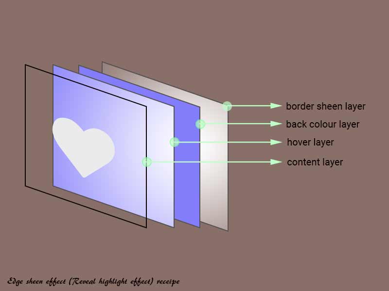
The key to the effect is to add a background plate with a radial gradient from white to transparent behind the content and make the background plate is slightly bigger than the content layer so that it appears like a border to the content layer. Bear with me. Let me explain.
I modified my previous recipe by transforming the tile layer into the background plate and called it the edge sheen layer. Then I added three child container elements to it.
-
A back colour layer to display the background colour of the element.
-
A hover layer to display the hover effect. I’ll be telling you about this later.
-
And a content layer to hold the content of the element.
 Recipe for edge sheen effect
I arranged all these child layers exactly to the centre of the edge sheen layer with flexbox. I reduced the dimensions of the back colour layer so that the edge sheen layer looked like the border of the back colour layer.
To move the sheen with the mouse, I tracked the coordinates of the pointer with the mouse move event and moved the position of the gradient with it. This made it appear like the borders lit up only when the mouse was near.
The next part of the reveal highlight effect is the faint gloss that appears and moves with the mouse over the back colour layer when the mouse hovers above the element. I achieved this effect using the hover layer that I added beforehand. The gloss was created with the same white to transparent radial gradient as the background for the hover layer. With the previously tracked mouse coordinates, I moved the gloss within the element. By using the mouse enter and mouse leave events, I toggled the gloss whenever the mouse moved in and out of the element. Here is how it looks.
To enjoy the beauty of the “edge sheen” effect, multiple interactive elements need to be near one another using the effect. So, I made a demo with multiple elements in an asymmetric grid. Enjoy!
Mobile users, if you cannot experience the effect then watch this video demo
Demo: edge sheen effect (Reveal highlight effect), © Vijaykoushik, 2019
Photo by Alex Hussein from Pexels
Further reading
-
Fluent design - Reveal highlight, by Michael - CodePen.
-
Microsoft Fluent Design (Reveal Highlight) by Shepshun - CodePen.
-
fluent-reveal-effect by d2phap - Github
Tweet