Translucency with Transparency
An experiment to implement Acrylic material of the Fluent Design System in HTML
Hey guys! So Windows 10 has been around for 2 years now with its attractive (it really is) colourful user interface, fancy start menu and live tiles. Yet the most captivating feature is the “blurry glass effect” that is used in store apps especially the mail, Groove Music, and the Store itself.
I’ve seen beautiful use of transparent elements in several websites[1], but what sets out this “blurry glass effect” is that you know what is in the background but you can’t see it clearly! The effect hides the details of what is behind and makes you inquisitive to see what is behind.
The “blurry glass effect” as I describe is called Acrylic Material[2] which is part of the “Fluent Design System”. It’s the name Microsoft gave to its “design guidelines” to build software for all windows 10 devices[3].
Now that you know what an Acrylic Material is, I’ll tell you about the experiment I did. As I said before, the acrylic material is so captivating that I thought to myself “Why shouldn’t I apply this in HTML?” and with that question I started researching on the internet for existing implementations and to break the question into simpler ones to get a better understanding. I found two good existing implementations (Lucky me!) of this effect – a pen on CodemyUi.com and a thread on Stack Overflow.
These implementations involved a parent container element with a picture as a background element, let’s called it “mommy” layer and 3 child container elements.
- A container element “blurry” with the blurred version of the mommy layer’s background using CSS filter property - blur[4].
- Another container element “noisy” with noise texture as a background.
- And finally, a third container element “showy” with the content text or image to be displayed and a colour overlay.
In the final step the second key property, the first being “Blur filter” in this effect “Transparency” which in contrast is named “Opacity”[5] in CSS. This is the finishing touch to this effect. I achieved translucency via both colour transparency, where one can add transparency to the colour using the alpha value of that colour with the rgba() function and the opacity property of CSS. I found that opacity of 0.3 or 30% is sufficient for this effect. These steps are pretty close to Microsoft’s own recipe of creating the acrylic material.
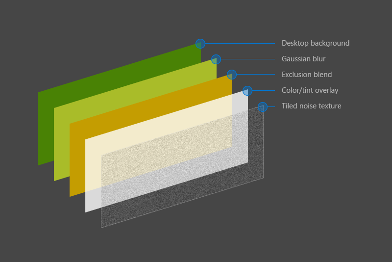 Micrososft’s acrylic recipe
Well, except for the exclusion blend. It can be added to the Blurry container with the CSS property “background-blend-mode"[6]. This is the recipe for HTML implementation
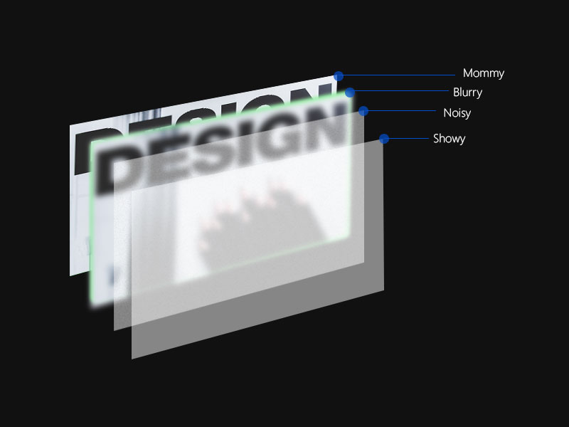 Html recipe for acrylic
The resulting effect is very close to the original and it’s awesome! Take a look
It’s not over yet. I know that CSS background property not only supports pictures but also gradients and pure colours. Can this effect be applied to gradients and colours? A question popped in my head. So, I started experimenting this with different backgrounds with different colours and different gradients. And the result of this experiment is... (Drum roll) YES! This effect works on images, gradients and colours as background. Change the background from image to a gradient. Or just use a pure colour omitting the former.
Here's a sample with the Indian flag's tri-color gradient as a background with the acrylic effect
I had so much fun learning about this effect. I learnt about CSS filters , pseudo elements[7] and efficient use of z-indexing to stack up multiple layers to create a single cool effect. Watch the effect in action in this fiddle. Click/tap on the to togle the navigation pane.
It's awesome na? Did you like it? Don’t forget to share what you think about this post in the comments.
Header Photo by Tim Gouw from Pexels
Footnotes
[1] Use of Transparency in Website Design, Examples - https://designmodo.com/transparency-website-design/
[2] Acrylic material - https://docs.microsoft.com/en-us/windows/uwp/design/style/acrylic
[3] Fluent design system - https://en.wikipedia.org/wiki/Fluent_Design_System
[4] CSS blur filter - https://developer.mozilla.org/en-US/docs/Web/CSS/filter
[5] CSS Opacity property - https://developer.mozilla.org/en-US/docs/Web/CSS/opacity
[6] Background-blend-mode property - https://developer.mozilla.org/en-US/docs/Web/CSS/background-blend-mode
[7] CSS pseudo elements - https://developer.mozilla.org/en/docs/Web/CSS/Pseudo-elements
Tweet